Case Study: Instant Transfers
Problem Statement
Customers could quickly and easily receive money in their PayPal accounts, but it was not possible to transfer the money to their bank accounts right away using the existing ACH rails. This was frustrating, especially when customers needed the money urgently. They didn’t want to have to wait the 3 to 5 days that it could take to get money from their PayPal balance into their bank account.
Business Goal
PayPal wanted to compete with Apple Pay, which gave customers a way to instantly transfer money received to a linked back account for a fee. PayPal also identified Zelle, a service that made it fast and easy for customers to receive money directly to a bank account, as a competitor.
Hypothesis: By allowing customers to transfer money to their bank account on the debit card rails, PayPal could offer near instantaneous transfers while capturing additional revenue.
What We Did
When we introduced the Instant Transfer feature, we wanted everyone to know about it. So, we put a big mention of it right on the Transfer Money page.
The content reads:
New! Get your money faster
Use your eligible debit card to transfer money to your bank account in about 30 minutes. There’s a $0.25 fee.
This headline and 2 sentences required extensive negotiations with multiple stakeholders. Our legal team had a LOT of disclosures they wanted us to add. I thought I’d done a pretty good job of including the required content while keeping it concise. But I’d left out an important bit of content. In testing, we realized that customers thought we’d eliminated the option to transfer money for free.Together with a team of UX researchers, product designers, and product managers, I participated in intensive user research and used the findings to iterate on content and design. We established that not being able to get their money quickly was a real pain point for customers. From there, we iterated on content and design and tested along the way to gauge customer perception and solicit feedback.
The drop-down design only exacerbated the problem, because any eligible debit cards showed up at the top of the list. Because the promo at the top only mentioned the faster transfer option for 25 cents, and because the drop-down menu showed the fee option first, customers didn’t realize that they could still transfer money for free. And they were not happy. We saw in user testing that customers didn’t understand they had a choice.
We tried moving the promo message right up front, before even asking customers to choose where they wanted to move their money. This helped with comprehension, but it didn’t go far enough. In testing, we saw that customers were still reluctant to move forward, so we probed to find out why.
Once we realized that customers simply weren’t understanding the flow as we had structured it, we ended up revising everything to make the choice clearer.
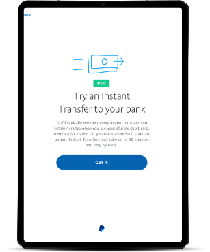
Here, the promo content mentions the free, standard option. And we spent a lot of time on the button text to set accurate expectations. When we brought users into the lab, we found that when the button said “Next” or “OK,” they didn’t want to move forward because they felt like they were agreeing to the instant transfer and the charge. We paid attention to this reaction and adjusted accordingly. When we used “Got It,” we saw a lot less hesitancy.
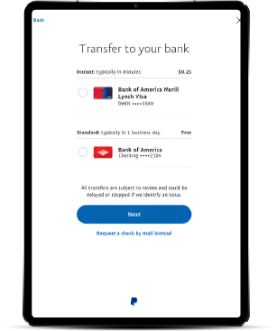
In previous designs with the drop-down menu and even with the bank and the card shown outright, people were toggling back and forth to see what their transfer options were. Here, we made everything visible and grouped the options by speed.
The End Result
PayPal customers value choice and control. By giving customers a clear choice and presenting the options on one screen, we made it easy for customers to decide how and when to get their money.
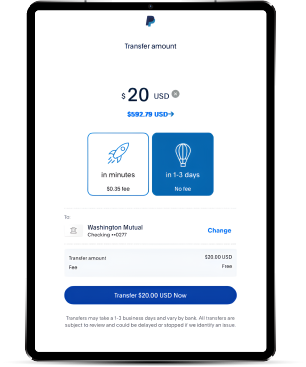
Once instant transfer abilities were well known to customers, we eliminated the interstitial and created a single page to clearly lay out the transfer options and the fees.
Customers appreciate the flexibility of being able to get money in minutes for a small fee when they need it. Or, if there’s no rush, they can wait and pay no fee at all.
This feature helped PayPal mitigate competitive threats from Apple Pay and Zelle. Best of all, it drove significant incremental revenue for the business.


